
This is a recap of days 6-10 of my self-made artist residency.
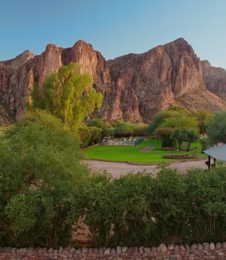
For days 6-10 of my painting month, I attended a workshop in Mesa, AZ at the beautiful Sahuaro Lake Ranch.
The workshop
For starters (and for better or for worse), this workshop was not about creating beautiful paintings of the breathtaking landscape. This landscapes focus was on creating color studies – accurate value and temperature representations of the scenes in front of us. Mitch Baird, the instructor, defined success as a completed “start” or block-in, where the major shapes in the painting are defined with the correct value (lightness/darkness) and temperature (color). That proved to be a lot harder than it sounds, especially in a new landscape.
Key learnings (or reinforced ideas)
Given this workshop’s focus on the fundamentals, there wasn’t a lot of groundbreaking new information I learned. Rather, the value I found was through Mitch’s delivery of the different concepts I’ve already been practicing and his feedback as I attempted to put it into practice. Here are the main takeaways I have from the workshop:
The lights are warm or cool, the shadows must be the opposite
This came up every day of the workshop and the learning for me was that this is a more strict rule than just a guideline. Mitch had the opportunity to study with Richard Schmid, and one of the learnings he passed on from the late master was that if you have a muddy color, it’s likely because you have a wrong cool color in your warms or a warm color in your cools.
To expand on this, when the sun is shining unobstructed, the lights in the painting should be in the warm family (colors leaning towards red, yellow, orange). In this situation, the shadows would be cool (colors that leaning towards blue/purple). An example that would lead to muddy colors is if the painting was sunlit (as opposed to overcast) and there was a yellow-y or red-ish color in the shadows. Admittedly, this is subjective but ultimately it is relative. In other words, nothing in the shadows should be warmer than anything in the lights.
And that brings me to the next key learning
Painting is a game of comparisons
Mitch taught us to always be moving our eyes around the subject and around the painting. His approach is to constantly compare colors and values to ensure the relationships are correct. In fact, that is whole challenge in front of us. If we can properly relate the color and value relationships, we can make a successful painting. Or at least a pairing that reads. Of course there is still composition, brushwork, etc, but those are build atop the foundation of color and value relationships.
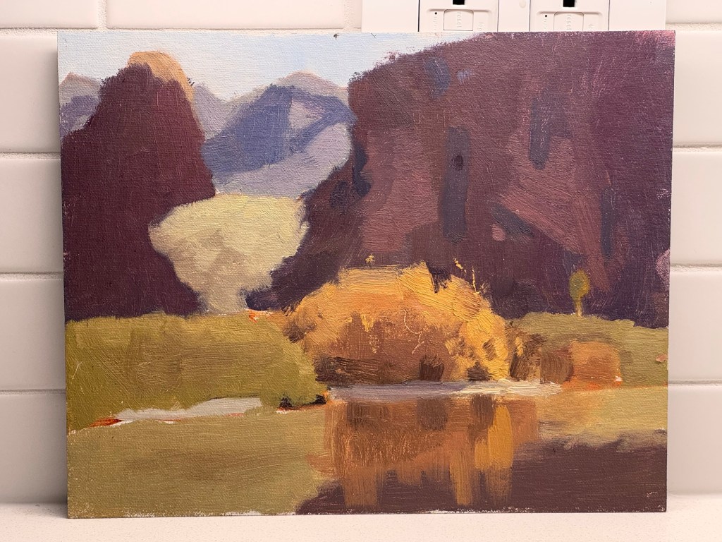
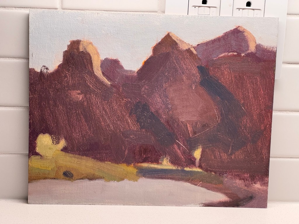
Highlights and my paintings
To restate what I started this post with, the point of this workshop was not to create finished paintings. I took that to heart and really embraced Mitch’s principles. As a result, the paintings I created are not strong paintings but they do represent putting these principles into practice. With a bit of work in the studio, these could certainly become successful paintings due to the foundation of color and value relationships I worked on.
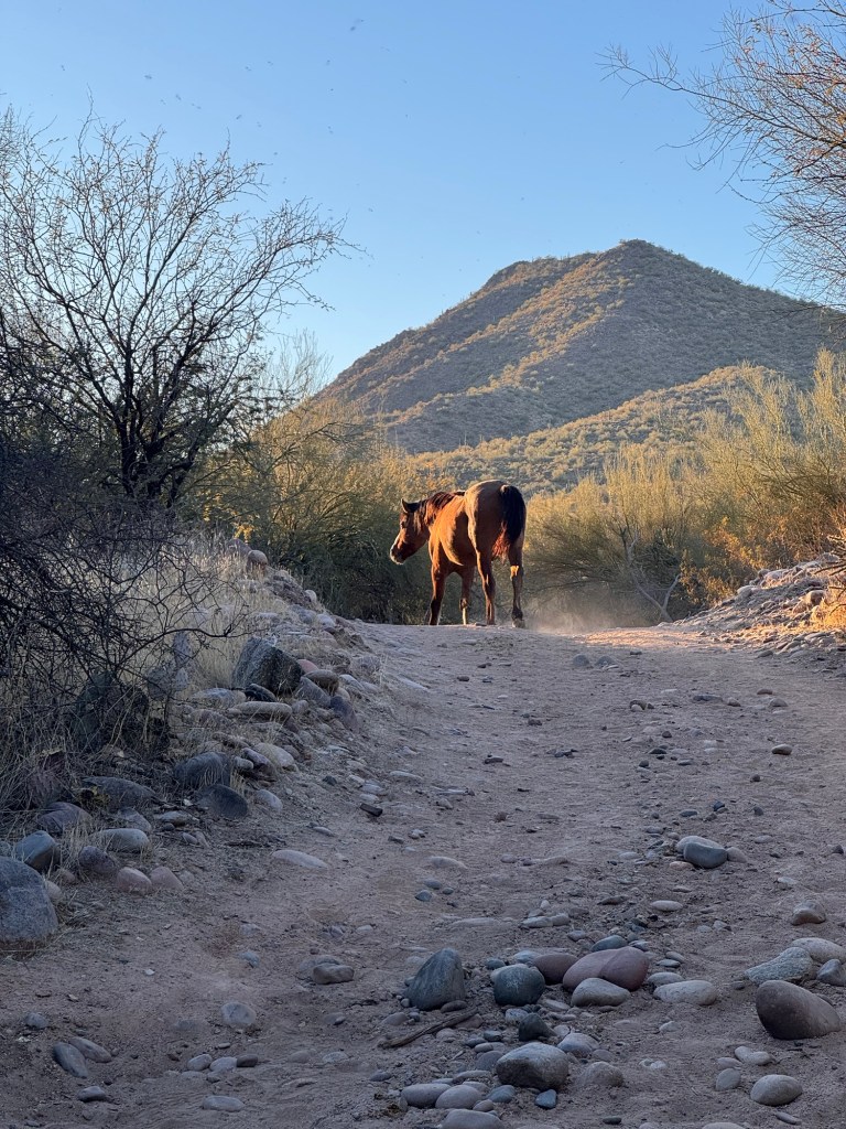
One highlight was when this wild horse came to check on my progress:
Conclusion
I had a wonderful time at this workshop and have a lot to work on and practice now. there is something comforting in the fact that it all boils down to a strong understanding of some basic principles.

Leave a comment